Project Life | Week Seven...
Posted by Leanne on
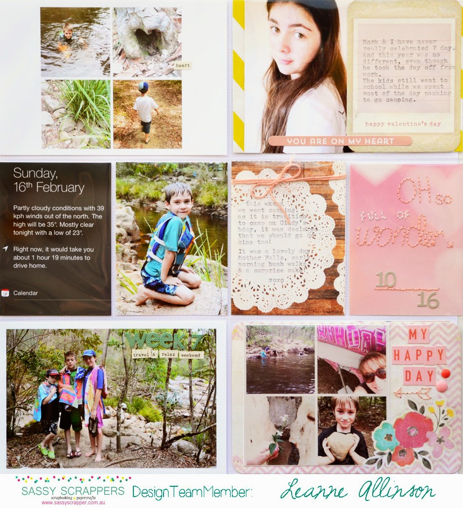
During Week Seven our family shared ordinary moments, went camping, celebrated my birthday and noted Valentine's Day. There was a variety of different situations captured through the camera lens, all with complex visual stimulation. To combat all of this, I could have easily converted all my photos to black and white images. But where would the fun be in that?? *grin*
To complete this spread I needed to use embellishments that would compliment the colours throughout my photos, without it looking completely cluttered.
There are many embellishments that can be used on your PL spreads which can add an element of interest without the clutter. The obvious ones are wood veneers, enamel dots, stickers and flairs. This week I have concentrated on coordinating enamel dots, stickers and stitching detail.
My favourite stickers to use on PL are simple and elegant words or phrases. I find that they enhance my journaling without detracting from the white space. Sometimes even using them in a sentence can break the monotony of your typed/written words and help accentuate the story. In my Week Seven spread I have used Studio Calico | Printshop Perfect Word Sheet.
This week I have also chosen to work with the Ombre Pink enamel dots by Freckled Fawn. By adding two of the darker colours to the bottom right Week Seven | page one, it helped to create a visual colour triangle with the top two pockets on the same page. They don't necessarily help to share the story but the enamel dots do create a colour balance and link between the pockets on the first page.
What did help document my story and was the subtle reminder of being outdoors, is the red flower sticker. Layering it over both the journaling card and photo creates a visual connection between both of these elements.
On the second page of my spread, I wanted to highlight areas without taking up too much space or adding extra bulk. I already have a lot of journaling and twelve photos on this page. To be included, my embellishments needed to be in the form of layers and not so overwhelming.
Immediately I knew I wanted to have more texture on the 3"x4" date card. My answer was to used some freestyle hand stitching. The embroidery thread used is in a similar colour to the background of the card. This was a deliberate choice so it wouldn't appear too busy or distract the eye from traveling across the page. I also wanted it to blend in but coordinate with the Freckled Fawn enamel dots and the October Afternoon mini alphas.


